Elements of Design
In the realm of Design, it’s not all about how something looks; it’s about how it works. A well-designed thing, whether that’s a website, a logo, a piece of furniture or just about anything else, needs to be able to
- communicate clearly,
- hold your attention and
- achieve its purpose.
The elements of design are essential aspects of design that, when used correctly, can help you to create something that
- looks good and
- functions well.
Here’s our brief and easy-to-follow guide on the ten fundamental elements of design and how you can use them to improve your work.
1. Line
The Foundation of All Design
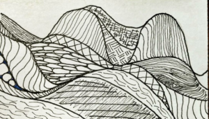
Lines are the simplest elements of design, the most basic of shapes, and the building blocks of more complex shapes and forms. Lines can be straight and long, curvy and sensual, thin and wispy, thick and heavy, implied between forms or objects. They create perceptions of
- movement,
- structure, and
- Direction.
How to Use Lines in Design
-
Creating Structure:
Lines can separate space and provide margins or frame space. In web design, lines are often used to segment different areas of the page or guide you through a site.
-
Leading the eye:
Lines can lead the eye to a focal point or guide the viewer through a composition. Diagonal lines can help to create motion in a still image, while horizontal lines can evoke stillness and tranquillity.
-
Emotional Properties:
Feelings can be evoked by the properties of a line, with soft, wiggly lines feeling comfortable and relaxed compared with sharp, jagged ones that might convey tension or excitement.
2. Shape
Forming the Basis of Design
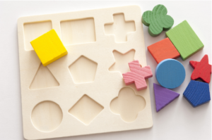
Shapes are filled areas enclosed by lines and are either
- Geometric (such as circles, triangles and squares) or ‘
- Organic (irregular, freeform shapes).
Shape is one of the most important elements of creating a form and is the core of a composition’s elements. Shape is also used to create symbols and icons.
Check out our Amplifying Design Impact: Visual Effects for Graphic Artists course on Jobsland.
How to Use Shapes in Design
-
Symbols and Icons:
Logos and icons use simple shapes because they are easy to recognise and remember. For example, the stop sign is circular, which is recognisable, and it is associated with the concept of stop.
-
Arrangement:
Balance and harmony can be achieved by the arrangement of the shapes used. Symmetrical arrangements tend to feel balanced and harmonious. In contrast, asymmetrical shapes can be used to create more dynamic and interesting compositions.
-
Overlapping:
Layering shapes in front of or behind each other creates the illusion of depth, adding dimension and making a design appear more three‑dimensional and lifelike.
3. Colour
The Emotional Powerhouse of Design
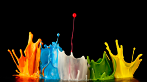
Of all the tools at a designer’s disposal, colour can be the most powerful. It can
- evoke feelings or moods,
- set the tone,
- communicate messages without words and
- create associations in the minds of your consumers.
It can make a design feel
- warm or cool,
- energetic or calm, and
- help to drive the interaction with your design.
How to Use Color in Design
-
Setting the Mood:
Colours evoke different moods. Warm colours (red, orange, yellow) are warm and exciting, while cool colours (blue, green) are calm and serene.
-
Use colour contrast:
Colour contrast will make some things more prominent by creating a clear boundary between the colour and its surroundings. For example, if you put a bright colour against a dark background, then that part of the design will stand out.
-
Communicating Brand Identity:
Colours are important for branding. A company’s colour scheme should be a reflection of its identity. Think of the exuberant red of Coke, which communicates energy and exhilaration, and the calming blue of Facebook, which communicates trust and reliability.
4. Texture
Adding Tactile Sensations to Visual Designs
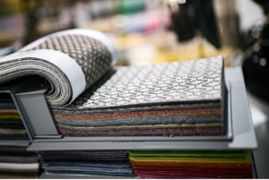
Texture is a term that describes the surface quality of a design: how it feels or at least appears to feel. The texture is
- physical (like the roughness of paper), or
- visual (how a texture is rendered on a digital display).
How to Use Texture in Design
Texture brings depth and interest to a design by adding visual complexity – a website background might use a subtle texture to make it appear more tactile and engaging than flat.
-
Contrasting textures:
Contrasting textures create tension and allow specific items to pop. A glassy button on a rough surface pops out and begs to be clicked.
-
Replicating Reality:
Product designers use textures to imitate real-world materials. A ‘wood-grain’ texture on a digital dashboard might make the design seem more natural and comforting.
5. Space
The Element of Breathing Room
Space, the area around and between elements in a design, is often referred to as negative space, but it’s anything but space. It is critical to create a composition that can breathe.
How to Use Space in Design
-
Compositional Focus:
The proper use of space can spotlight certain parts of a design. Widening the space around a headline or call-to-action button can make it the focus of the composition.
-
Balancing space:
The space in a design helps it balance so that it is manageable. With more negative space, a design will usually feel more sophisticated and easier to look at.
-
Readability:
Spacing is crucial for readability. The more space you give your text in terms of line height and margins, the more legible it will be.
6. Form
Giving Shape to Three-Dimensional Design
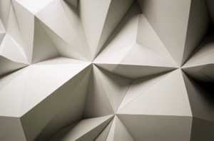
Form is the three-dimensional quality of an object, such as its
- depth,
- width, and
- height.
Shapes are two-dimensional, but forms are what shapes become when an object is developed into three dimensions.
How to Use Form in Design
-
Realistic forms:
Forms have the potential to make a design more realistic and physical by giving it visual dimensions. To illustrate this point, the 3D rendering of a product subtly conveys the physical presence and functionality of the original product.
-
Shading and Light:
Shadows cast add a level of depth to the form of an object and allow it to almost jump off of a flat surface. This can be useful when creating an object that is intended to look like it has volume. Sometimes, this technique is also used in icon design and illustration.
-
Dynamic Composition:
Forms can create dynamic compositions by adding layers and depth. Overlapping forms can suggest movement and interaction within a design.
7. Value
The Element of Light and Darkness
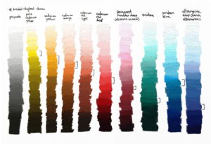
Value is the lightness or darkness of a Colour or shade in a design. It is another important element for creating
- contrast,
- depth and
- emphasis in your work.
How to Use Value in Design
-
Contrast:
High contrast in value can make elements stand out, while low contrast can create a more subtle, harmonious look. Light text on a dark background pops.
-
Value for defining shapes and forms:
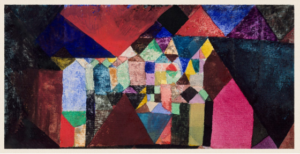
Value is a fundamental tool for defining shapes and forms through the ways in which light interacts with forms. Gradients, for instance, create an illusion of a three-dimensional form on a two-dimensional surface.
-
Mood:
Because of the scale of value, a darker value tends to be more serious than a lighter value, which tends to be more airy or open.
8. Balance
Achieving Harmony in Composition
Balance refers to the distribution of visual weight in a design. It is either
- symmetrical (evenly balanced) or
- asymmetrical (balanced through contrast and variety rather than symmetry).
How to Use Balance in Design
-
Symmetrical Balanced
Symmetrical Balanced designs are mirrored on either side of an axis, creating a formal and orderly feel. This type of balance is often used in traditional design and architecture.

-
Asymmetrical Balance:
Asymmetry can create more dynamic and interesting designs when elements of varying visual weight are balanced. For example, a heavy dark element can be balanced by a lighter series of elements.
-
Radial Balance:
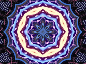
Elements are arranged around a central point and spread out from there, like a flower about to bloom. It’s a common design template for logos and mandalas.
9. Hierarchy
Guiding the Viewer’s Eye
Hierarchy, on the other hand, is the grouping of elements to indicate their relative importance. This means that the most important information should be placed first and that the eye’s journey should be clear.
How to Use Hierarchy in Design
-
Size and Scale:
Large elements attract more attention and are, therefore, good for headlines or key visuals; on the other hand, small elements are seen as less important and are used for secondary information.
-
Colour and contrast:
Use bright colours and strong contrast to make your most important elements of design pop out. A brightly coloured ‘call-to-action’ button, for instance, can sit on a muted background.
-
Position and Placement:
Elements placed on the page have an order of importance. For example, items at the top of the page or in the centre of a composition are seen first and are given more weight.
10. Unity
Creating a Cohesive Design
The third principle of unity ensures that all parts of a design work together in harmony. A good design has unity when all parts appear to be connected and support the central message.
How to Use Unity in Design
-
Uniform Style:
Adopting the same style for colours, fonts and shapes throughout a design will create a sense of unity. A design that uses the same colour palette and typography across every page will appear more unified.
-
Repetition:
Repeating certain elements of design, such as a particular shape, colour or pattern, can help establish unity in a design. This technique helps unite the different parts of a design and bring a sense of order to the work.
-
Alignment and Proximity:
Good alignment and proper proximity of elements help to create unity by giving the impression that the elements are visually connected. Aligned and close elements of design are perceived as related, which can help the overall design appear more cohesive.
Conclusion
The ten basic elements of design are line, shape, colour, texture, space, form, value, balance, hierarchy and unity. By using these elements, you can create great designs. It’s true; understanding these elements is the key to using design successfully to
- convey your message and
- engage your audience.
Whether you’re an experienced designer or just starting, I hope that you’ll keep these elements of design in mind as you work. Design is both an art and a science. If you have these tools in your toolbox, you’ll be able to solve many creative problems.
